2000/2019
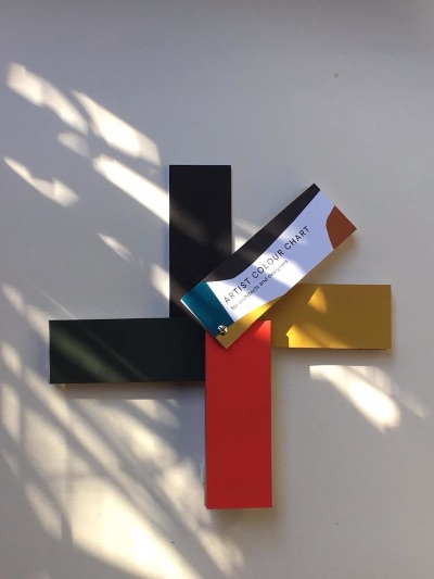
artist colour chart for architects and designers © claudia valsells
Request:
Colour has always been my inspiration: a source of knowledge, a way of life!
Because of my devotion to colour, 20 years ago, as a colorist specializing in interior design and architecture, I selected, gathered, and synthesized the colors I considered fundamental for these fields and made a colour chart for their reference.
I recently updated that colour chart and want to share it, this time, as a colour artist, because I believe it all to be fruit of my artistic and personal research.
I want to ask you to send me a photo opening the colour chart to
claudia@claudiacolor.com to intuit other views, guess other colour palettes, and grasp, recognize and appreciate other views!
Thank you so much!
Features :
Designed and self-published in 1999 with the idea of facilitating the communication of colour in the world of architecture, interior design and industrial design.
This chart is the fruit of more than two decades of close collaboration with architects and designers, defining colours so as to find the most appropriate, sharpest and most luminous tone. It is precisely in making such fine adjustments that the colourist must show her natural skill and chromatic instinct, so that the chosen tone is ideal for the place for which it is intended, thus demonstrating her “gift of colours”.
Faced with the infinite variety now offered by the chemical paint and colour industry and prompted by my day-to-day experience working with architects and designers, I detected the need to create a range of colours specifically for these professionals. This entailed a minutely detailed effort of synthesis, drawing on my personal appreciation of the world of colour, and a painstaking selection, combination and grouping of tones and hues.
The chart was received with enthusiasm and sold well for 15 years. It has been used in very many projects and is still in use in almost all Barcelona’s architecture and design studios.
This reissue confirms my initial intention that it be conceived as essentially timeless.
Technical characteristics:
Fan deck with 142 colours using real paint, so that the user can see each colour reproduced exactly as it will appear once applied to a surface.
The acetate of the cover can be placed over each card to see the colour in gloss finish.
The range of colours has been designed for use in architecture, on both exterior and interior surfaces.
It can also be used in industrial design works.
The reference number printed on the back of each card is the name of the colour, regardless of the material from which the colour is manufactured.
Some colours may not be able to be manufactured in all kinds of materials or by all manufacturers.
In any event, the accuracy of reproduction of a colour will be directly proportional to the quality of the raw material with which it is manufactured.
About a colour chart:
From scientific experiment to artistic concern, from Munsell’s diagrams and Goethe’s studies to Le Corbusier’s Salubra and the almost infinite possible combinations of electronics, the colour chart has always existed to facilitate the communication of colour. A mere organic, hierarchical and chromatic division in its origin, a method of plastic expression and aesthetic positioning in its development, this instrument, which came to democratize design and encourage the creative impulse, has seen in its years of life how the use of color by the architectural sector has been diminishing, limited perhaps because of certain social prejudices and canons encouraged by advertising and the market. The pristine white, the sad black, the jinxed yellow, the garish red.
Monopolized the business of colors available by the painting houses, relegated the work of the colorist to the background due to ignorance or fear of architects and clients to make a mistake or be branded as eccentric, it is in this context that the artist Claudia Valsells created in 2000 her own color chart, a specific chromatic selection to facilitate the communication of color in the world of architecture and industrial design. At that time her project was based on synthesizing.
And in this process of synthesis, over time she created her own chromatic language.
images:
#1 © Ester Rovira @dadabarcelona
#2 © Montse Vicens @int_sight
#3 © Mar Eslpa Povo @maresplapovo


